
The Head of CX for a national retail chain felt confident. Their primary KPI, a 95% customer satisfaction score, painted a picture of success that justified their team's budget and strategy. Yet, a troubling pattern emerged that surveys failed to capture. Customer churn was ticking upwards, quietly eroding market share. The high-level metrics were masking a dangerous reality. Your metrics are lying to you not because they're wrong, but because they're incomplete. The support team was resolving issues quickly, but the quality of those resolutions was poor, creating repeat calls and deep-seated frustration that never made it into a CSAT survey.
This is not an uncommon scenario. It's a strategic blind spot created by relying on lagging indicators alone. The cost of this visibility gap is immense. Companies that fail to connect agent performance to real customer sentiment see churn rates as much as 15% higher than their competitors who leverage deeper conversational insights. The data you are not seeing is precisely what determines your future success. Real-time access to call center data is crucial, as it can reveal hidden trends that traditional reporting misses. Your traditional call center dashboard might show you what happened, but it will not show you why. And the "why" is where strategic advantage is won or lost.
Most dashboards display performance data using bar charts and other visualizations, but these can be insufficient for uncovering the root causes behind the numbers.
To truly connect agent performance to customer sentiment, it's essential to monitor performance closely to ensure both productivity and service quality.
What is a Call Center Agent Performance Dashboard?
A call center agent performance dashboard is a centralized, visual interface (often referred to as a contact center dashboard) that provides real-time insights and historical trends on the effectiveness and efficiency of individual agents and the entire support team.
Unlike basic reporting that simply lists historical data like calls handled or average time per call, a true performance dashboard synthesizes multiple data sources into actionable insights. Call center KPIs are tracked and visualized in the dashboard, allowing managers to monitor agent performance and customer engagements effectively.
It connects operational metrics with customer experience outcomes, giving leaders a holistic view of performance. A real-time dashboard enables immediate operational decisions by displaying live metrics and trends. It tells you why customers are calling, not just that they called. These dashboards allow leaders to explore data in depth to uncover trends and opportunities.
Why Agent Performance Dashboards Drive Business Results
For a Head of CX, success is defined by measurable business impact. An advanced agent performance dashboard is the engine that drives these results. It transforms the support center from a cost center into a strategic intelligence hub, directly influencing the KPIs that matter to the executive team. Dashboards also help monitor team performance and team metrics, enabling continuous improvement and more effective resource allocation.
Imagine identifying the root cause of a 5% increase in churn not weeks later through a survey, but in real time as it happens. A modern dashboard armed with conversation intelligence can detect a sudden spike in customer frustration around a specific product flaw. This allows you to alert engineering, update agent talking points, and proactively message affected users before the issue escalates into widespread dissatisfaction and revenue loss.
This is the shift from reactive problem-solving to proactive strategic intervention. By analyzing every interaction, you can directly link agent behaviors to business outcomes and support productive agents who drive happy customers through actionable insights:
Churn Reduction: Identify at-risk customers based on sentiment analysis and interaction patterns. Coach agents on specific retention-driving language and tactics, with performance tracked on the dashboard.
Reduced Cost to Serve: Pinpoint the drivers of repeat calls and channel switching. By resolving issues correctly the first time, you lower call volume and improve operational performance.
Increased Revenue: Uncover cross-sell and upsell opportunities mentioned in conversations. Coach agents to recognize these moments, turning service interactions into revenue generators.
Improved Customer Lifetime Value: Consistently delivering high-quality service builds loyalty. A dashboard helps you systematically improve service performance, which is the foundation of long-term customer relationships.
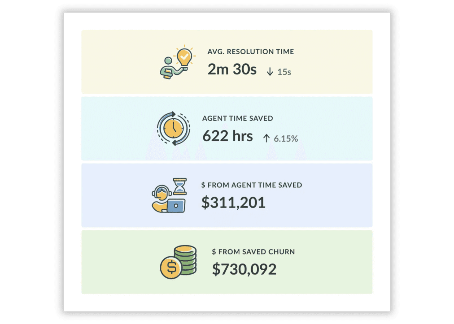
Ultimately, it provides the ROI narrative you need. You can walk into a board meeting with concrete data showing how a 10% improvement in first contact resolution reduced operational costs by $500,000 and prevented an estimated $1.2 million in customer churn. This is how you stop defending your budget and start proving your team's revenue impact.
Essential Dashboard Features That Actually Matter
Not all dashboards are created equal. Many are cluttered with vanity metrics that create noise, not clarity. An effective dashboard focuses on features that provide a direct line of sight from agent activity to business impact. Contact centers rely on these dashboards as centralized communication hubs, integrating multiple channels and leveraging AI and automation to achieve operational excellence.
Real-Time Data Visualization: Waiting 24 hours for yesterday's dashboard to update isn't a strategy; it's a handicap. Live data on call volume, agent availability, wait times, and service level adherence allows team leaders to make immediate adjustments to staffing and workflows. When call volume spikes unexpectedly at 2 PM, you need to know at 2:05, not during tomorrow's standup meeting. Real-time visibility means you're fixing problems while they're still small, not after they've already cost you customers.
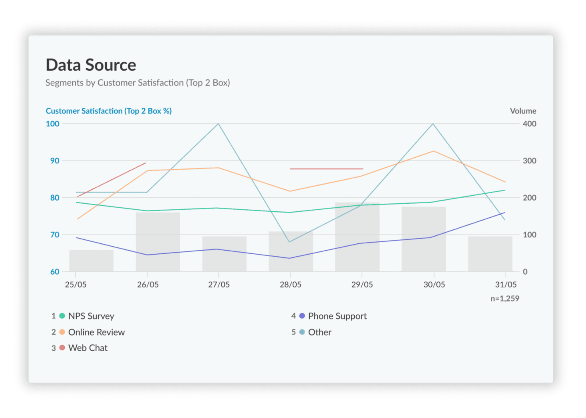
Unified Cross-Channel View: Your customers don't think in channels—they think in problems. They'll start with chat, escalate to phone, then follow up via email, all for the same issue. If your dashboard only shows you phone metrics, you're missing 60% of the customer journey. A unified view consolidates phone, chat, email, and social interactions into one holistic picture of agent performance. This isn't a nice-to-have feature. Without it, you're making staffing and coaching decisions based on incomplete data.
Root Cause Analysis Tools: A spike in call volume tells you nothing. A spike in call volume about a specific billing error tells you everything. Great dashboards don't just show you what is happening—they help you understand why. This means moving beyond numbers to analyze the content of conversations. This is where conversation intelligence becomes the difference between reacting to fires and preventing them. One Kapiche customer discovered that 23% of their support volume was driven by confusion around a single checkout flow. They fixed the flow and reduced call volume by 4,800 tickets per month. That's $67,000 in support costs eliminated—because they could see the "why" behind the numbers.
Customizable Role-Based Views: A frontline team leader needs to see individual agent scorecards and real-time queue status. The Head of CX needs trend analysis tied to business KPIs. Your CFO wants to see the cost per contact and ROI. One-size-fits-all dashboards force everyone to wade through irrelevant metrics to find what matters to them. The result? Nobody uses it. Role-based views ensure each stakeholder gets exactly the insights they need to make decisions, in the format that makes sense for their job. When your dashboard adapts to your team instead of forcing your team to adapt to it, adoption goes from 30% to 95%.
Qualitative Insight & Sentiment Analysis powered by Kapiche: This is the feature that separates leading CX teams from the rest. Most analytics tools analyze 5% of your customer feedback—the structured stuff from surveys. Kapiche analyzes 100% of your customer conversations, using AI to understand the nuanced topics, themes, and sentiment within every interaction. It goes beyond keywords to grasp context. "This is fine" shows up as neutral in basic sentiment analysis. Kapiche knows it's frustrated sarcasm. Instead of guessing why CSAT scores dropped, you see the exact drivers, whether it's a confusing billing policy, a buggy feature, or agents using language that creates friction. This turns unstructured conversation data into structured, actionable intelligence that your entire business can use to make profitable decisions.
Key Metrics Every CX Leader Should Track
The metrics you track define the performance you see. Choosing the right center metrics and visualizing them through real-time dashboards enables accurate measurement and smarter operational decisions. Organizing them by business impact and aligning with center KPIs ensures you focus on what truly moves the needle. It is also critical to understand the difference between leading and lagging indicators, while lagging indicators (like CSAT or Churn Rate) measure past outcomes, leading indicators (like First Contact Resolution) help predict future outcomes. A balanced metrics program monitors both to create a complete view of performance.
Retention & Revenue Impact Metrics
First Contact Resolution (FCR): The percentage of issues your agents actually fix the first time, versus the ones that turn into repeat calls that drain your budget and frustrate customers. A high FCR signals that customers' issues are being handled efficiently, while also reflecting agent effectiveness and streamlined processes. If your FCR is below 70%, you're essentially paying agents to create more work. Every repeat call costs you $6-15 in direct expenses, plus the compounding cost of customer frustration that never shows up in your accounting software but shows up in your churn rate.
Customer Satisfaction (CSAT) /Net Promoter Score (NPS): CSAT captures customer sentiment immediately after an interaction. NPS measures overall brand sentiment. Both are lagging indicators that tell you what already happened. They're valuable for tracking trends, but they're terrible for diagnosis. A CSAT score of 4.2 doesn't tell you why customers are unhappy or which customers are about to churn. To drive meaningful improvement, pair these scores with operational metrics and conversation analysis that reveal what's actually driving those numbers.
Customer Churn Rate: The percentage of customers who stop doing business with you. This is the ultimate lagging indicator of business health, often influenced directly by service quality. The real question isn't "what's our churn rate?" It's "which service failures are causing churn, and how much revenue are they costing us?" Monitoring churn rate without connecting it to specific interaction patterns is like checking your bank balance without looking at what you're spending money on.
Cost & Efficiency Metrics
Average Handle Time (AHT): The average time spent managing a customer interaction, from initiation through wrap-up. AHT is useful for measuring efficiency, but optimizing for speed alone is dangerous. Pushing AHT down by 30 seconds sounds great until you realize you've also pushed FCR down by 15% because agents are rushing through conversations. The goal is to find the right balance between efficiency and effectiveness—fast enough to manage costs, thorough enough to actually solve problems.
Cost Per Contact: The total cost of operating the contact center divided by the total number of contacts. This metric reveals the financial efficiency of your support operations. But here's what most teams miss: the lowest cost per contact isn't always the best outcome. If you're spending $8 per contact but creating repeat calls because issues aren't fully resolved, your real cost per issue is $24. Track this metric alongside FCR to understand your true cost to serve.
Agent Utilization Rate: The percentage of time agents are actively engaged in call-related work versus idle. This helps center managers with workforce planning and scheduling to ensure optimal performance. But utilization above 85% is a warning sign, not a target. Over-utilized agents burn out, deliver lower-quality service, and leave. The best contact centers optimize for sustainable performance, not maximum extraction. Accurate forecasting is crucial here, as it enables better alignment of staffing levels with predicted workload, reducing both overstaffing and the kind of understaffing that destroys both employee and customer experience.
Experience & Quality Metrics
Abandonment Rate: The percentage of inbound calls where the customer hangs up before connecting with an agent. Every abandoned call represents a customer so frustrated they gave up on getting help. Some will try again later (adding to your call volume). Many won't (adding to your churn rate). A high abandonment rate is a clear sign of inadequate staffing, poor forecasting, or IVR systems that waste customer time. Reducing this metric isn't just about improving customer experience—it's about capturing revenue that's literally hanging up on you.
Average Wait Time: The average time a customer spends in a queue before speaking to an agent. This is a core indicator of customer effort and potential frustration. Industry data shows that customer satisfaction drops 1% for every 10 seconds of wait time after the first minute. If your average wait time is three minutes, you're starting every conversation with the customer already annoyed. Monitor this metric religiously and staff accordingly, or accept that you're voluntarily choosing to frustrate customers before your agents even say hello.
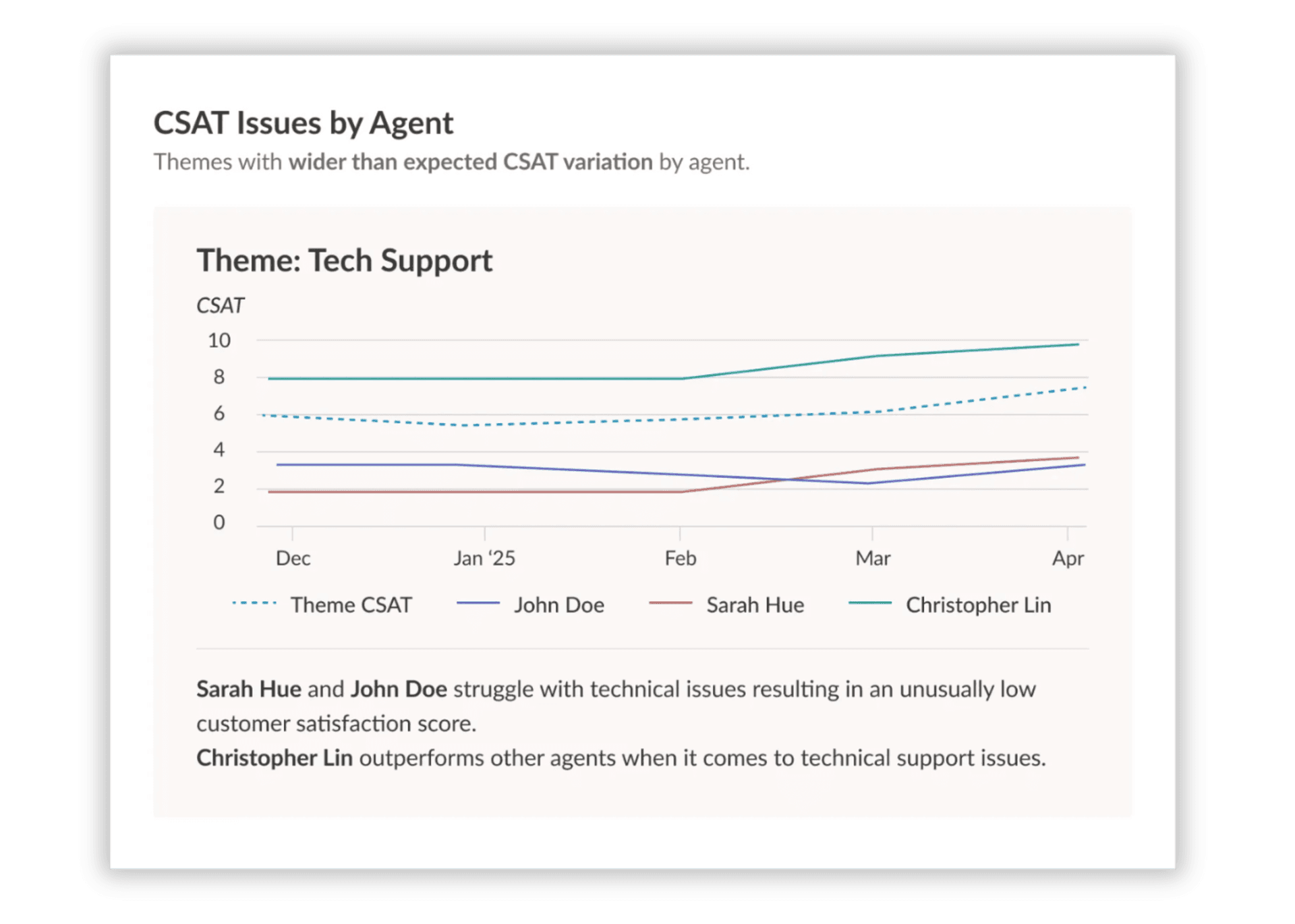
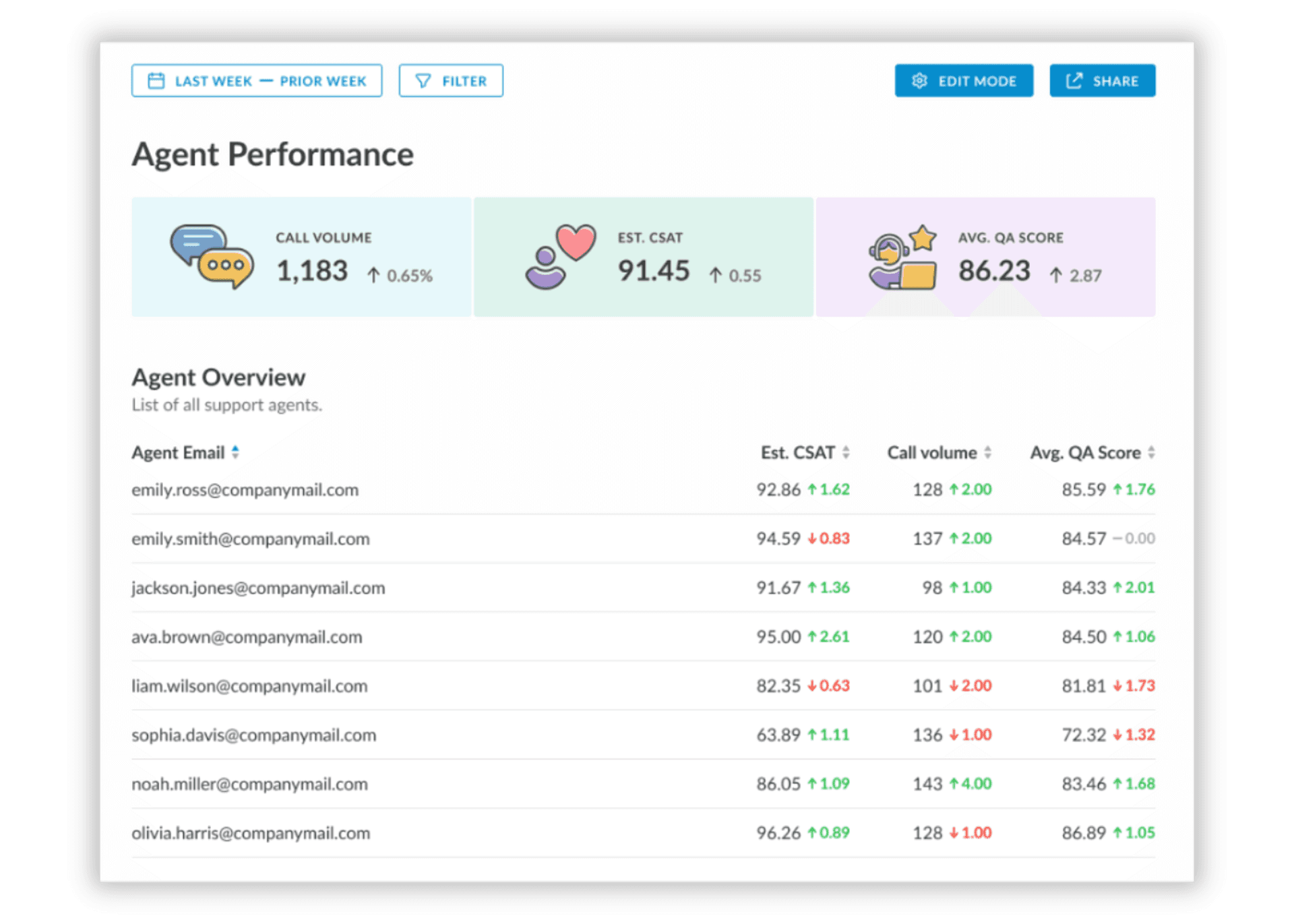
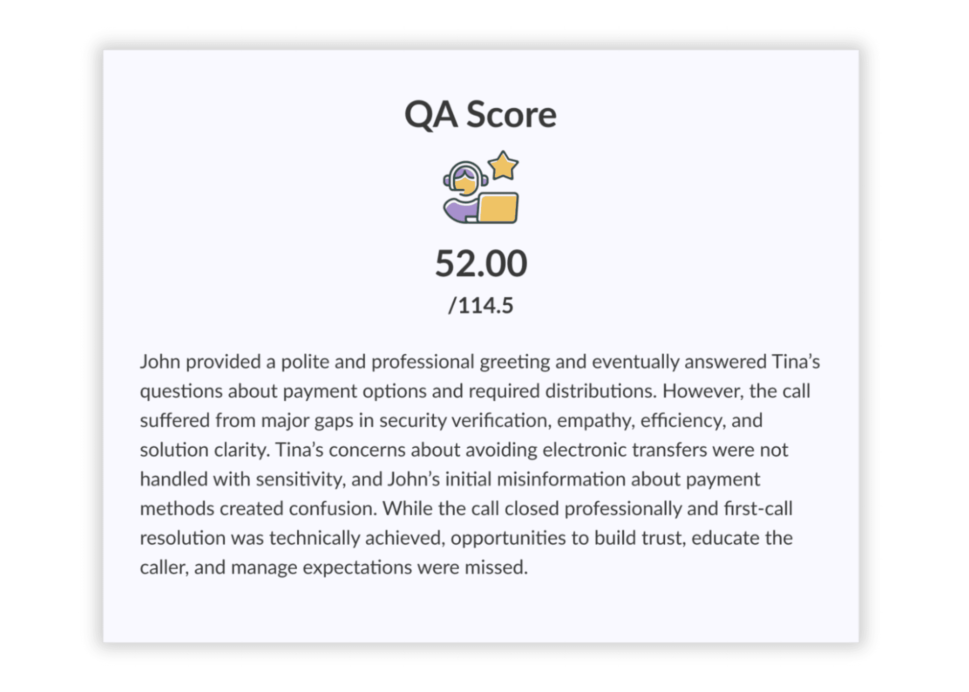
Quality Assurance (QA) Scores: Scores derived from internal evaluations of customer interactions. Traditional QA samples 1-3% of interactions, creating blind spots and bias. When powered by AI and conversation intelligence, QA can scale across 100% of interactions, offering a complete and unbiased view of service quality. Combining automated QA insights with direct customer feedback reveals exactly which agent behaviors drive positive outcomes and which drive customers away. This is the difference between hoping your agents are performing well and knowing exactly how each agent is performing on every interaction.


